
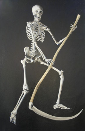
 This evening I spent a little time simply looking at the painting to see what it needs to be complete. I spend quite a lot of time doing this with paintings, contemplating which direction they should go in after finishing a good chunk of the work. I found it very distracting to look at the patchy background of the piece, so I laid down a unifying and darkening layer of Ultramarine Blue over the chocolate Van Dyke Brown. This makes the darks so rich that they fall away into void, while leaving a slight trace of blue around the edges of the figure that I have liked for years, using it in many of the big paintings. The glossy black background makes the contrast richer, so the skeleton pops out even more three dimensionally than before.
I know I’ll have to re-do this blue layer later because I won’t be able to lay down the heads without making an impact on the areas around them, but this really has helped to clear the painting in my mind; from here on it’s about fixing absences and improving the composition.
I’m keen to finish this piece because I’d like to have posters of it ready for sale at the exhibit in mid-May. I need to figure out where else I might be able to borrow a crown or two for the King and Queen.


that finger looks funny on the skeletons left hand. i really like the dimension made from the outstretched arms and the way the scythe hits. AIR GUITAR! only Pearce would choose to model Death after his rockstar-esque attitude.