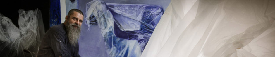
 Here we go, Introducing Prussian blue to the wing has made already made a huge difference to the feel of the skeleton, making the white of the bones pop out from the wing most effectively. I love the way blues sit over browns, there’s so much range from warmth to cool and dark to light. Prussian blue has the added advantage of offering a beautifully transparent glaze with a really dark, almost black flavour when it’s used as a thicker pigment. I couldn’t get both wings done this afternoon, with limited time in the studio, but feel pretty good about what I got done, and thoroughly enjoyed doing the work.
Once I finish the blue glaze over the other wing I’ll move into repainting the whites of the bones to make the definition of the bones from the background clearer.
The picture is shot at a strange angle because of the terrible lighting glare that was on the painting this afternoon. I couldn’t really control it the way I needed to because my students have to finish their work ready for finals in one week. The best of them are working really hard to get their work to look fantastic, with dramatic results.
Making good art is ninety eight percent hard work, and one percent good ideas. The remaining one precent is reserved for sheer blind good luck.


The blue looks fabulous, and of course you are dead on about the luck!